How to choose the perfect paint colour
< Back
5 MINUTE READ
Painting Essentials
Painting Essentials | November 26, 2020
November 26, 2020
Share via
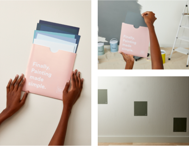
If you’ve ever taken on the challenge yourself, you’ll know that the most tedious part of painting is choosing the right colour. It means going to your local paint store, staring at sample walls, flipping through brochures and scanning colour fans to find ‘the one’. Then there’s the messy and expensive tester pots (don’t even get us started!). That’s before you found us. At Simply Colour, we’re all about simplifying the painting process, from start to finish – simply put, we take the pain out of painting.
Crash course on colour
It’s been well-documented that colours can have a real effect on your mood. So, when choosing your colour, it’s important that the shade you select sparks real happiness. But until you have an understanding of the different types of colours available, this is tricky to do.
First and foremost, it can help to know whether you are looking for cooler colours or something a little warmer. Cool colours are your blues, greens and greys whilst warmer colours are your yellows, oranges, reds and pinks. Generally speaking, cool colours are known for having a more calming and relaxing effect, while warmer ones are more invigorating.

Start with a swatch
Consider our peel + stick swatches your mess-free, stress-free sampling solution (and the most accurate way to pick a colour you’ll love). These handy 20 x 21cm stickers are delivered straight to your door, so you can choose them right now without having to set foot in a supply store.
Study your surrounds
If you’re unsure of which swatch to test out, start by asking yourself what inspires you. Look at your clothing, décor and artwork – the colours you’ve chosen in the past will give you a good idea of your natural style and colour inclinations. Next, consider the space itself – what else is in the room you plan on painting? Place your swatches next to your furniture, finishes and curtains to get a real feel for how it will meld with the others.
Remember that our swatches were designed to be stuck and re-stuck, so be sure to move them around the room and view how they change depending on the light and time of day. That way, when you do choose a colour, there are no unexpected surprises!
Rules you can rely on
Interior decorators and designers alike have a few golden rules that are worth considering before you make the final call. One is the 60: 30: 10 ratio, used to balance the paint colours used in your space. ‘60’ refers to your primary colour – in most cases this will mean your walls. ‘30’ refers to your secondary colour – this may be your flooring or soft furnishings. The final ‘10’ refers to your accent colour – this could be your artworks, accessories or décor that should stand out from everything else. Another way to think about using colours is as they exist in the world around you. This means bringing them into your space vertically, from light to dark. Darker colours are generally used on the ground, medium-dark colours are used in your line of sight (like foliage and buildings) and the lightest colours are used on your ceilings (just like the sky).
Lighting is everything
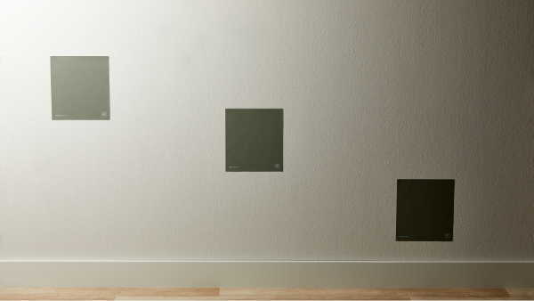
Perhaps one of (if not the) most important thing to consider before choosing your paint colour is light. It all starts with light – how much, and what kind of it do you have in your space? Is the room very light, very dark, always dim? The lighting of a space will change throughout the course of a day, so remember that the colour you see in the morning will not necessarily be the same colour you see at night. The beauty of our peel + stick swatches is that you can move them around a space, placing them in the darkest or lightest parts of your home. That way, you get a true reflection of how that colour will look throughout the course of a day. Some colours absorb surrounding hues better than others (for instance white walls will reflect the colours that surround them a great deal, while darker walls will absorb these colours more). Even artificial lights play a role in the way your colours look. Warmer lighting will soften and warm up a space, while fluorescent lights will instantly make a space feel cooler.
Here comes the sun
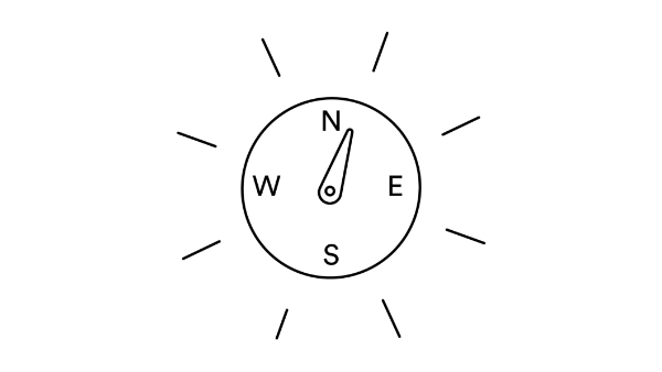
Just like the types of light in your space, so too does the direction of the sun have an effect on how a colour will look in your space. North-facing rooms generally have a much cooler light overall, which means it’s better to stay away from neutrals and go for something a little more vibrant. South-facing rooms are great for either warm or cool colours – the high density of light will make all types of colours look equally impressive. For a richer effect, choose darker shades and for a sunnier look, opt for colours that are light and bright. East-facing rooms are known for their warm glow in the morning and a more blueish light in the later parts of the day which makes them well-suited to warmer shades (anything between red and yellow).
West-facing rooms have the opposite effect – lovely warm lighting in the evening and a much darker and bluer atmosphere in the morning. For the most effective results, place our peel + stick swatches on different parts of your room’s walls, and observe it in the morning and at night. By doing so, you’ll know exactly what subtle changes the lighting has on the colour, depending on the time of day.
By now you should feel ready to start making some colour selections. Why not start by taking a look at our 60 timeless colours, curated for you with the help of our in-house colour psychologist, trend expert and interior decorator.
Simple tip
If you still feel unsure of where to start, answer a few easy questions and our colour expert will find the perfect match for you!
A look at our warm colours

Warm Yellow
Smooth & buttery, this gentle yellow will have you basking in a soft glow, all year long.
View Colour


A look at our cool colours

Muted Blue
Soft and unassuming, this peaceful shade is perfect for creating serene interiors you’ll love.
View Colour
Blue Grey
This blueish grey is as calming as it is relaxing – perfect for creating cool, sophisticated spaces.
View Colour
Sage Green
Think soft, velvety sage leaves. This subtle colour, with grey undertones is perfect for opening up interior spaces.
View Colour
Mid Blue
Think inky blue. This deep, rich shade will bring striking beauty to any space.
View Colour