Colours to keep an eye on in 2021
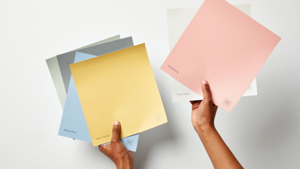
We’re lovers of all things colourful. And for us that means keeping our eyes out for the most popular shades making their way into people’s hearts and homes. Here’s a sneak peek at the five colours we think will make an impact this year, and how to make them work in your home…
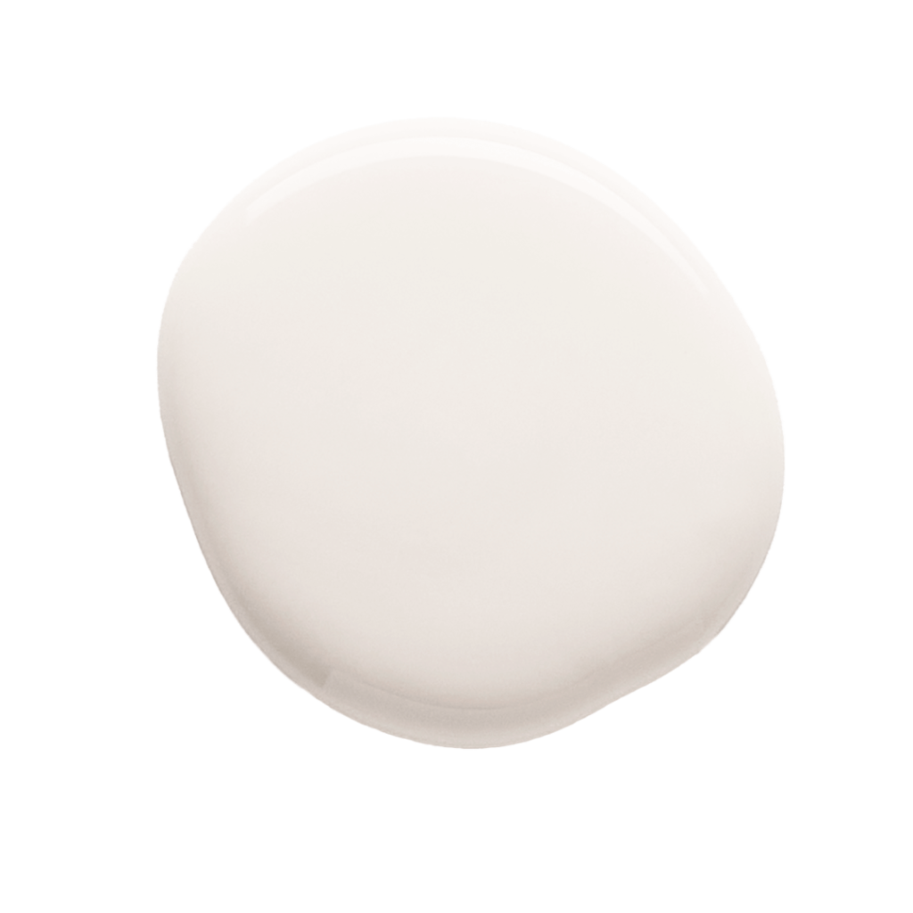
Get grounded with Muted Brown
If it’s an earthy shade that brings nothing but calm you’re looking for, then Muted Brown is your perfect match. This subtle neutral is as gentle as it is versatile, creating that interior calmness that people are seeking, now more than ever. Since spending more time at home, many are looking to bring the beauty of the outdoors in, making stylish neutrals like this even more popular. An earthy shade can help you feel at ease in a space and bring that calmness needed on what can feel like crazy days.
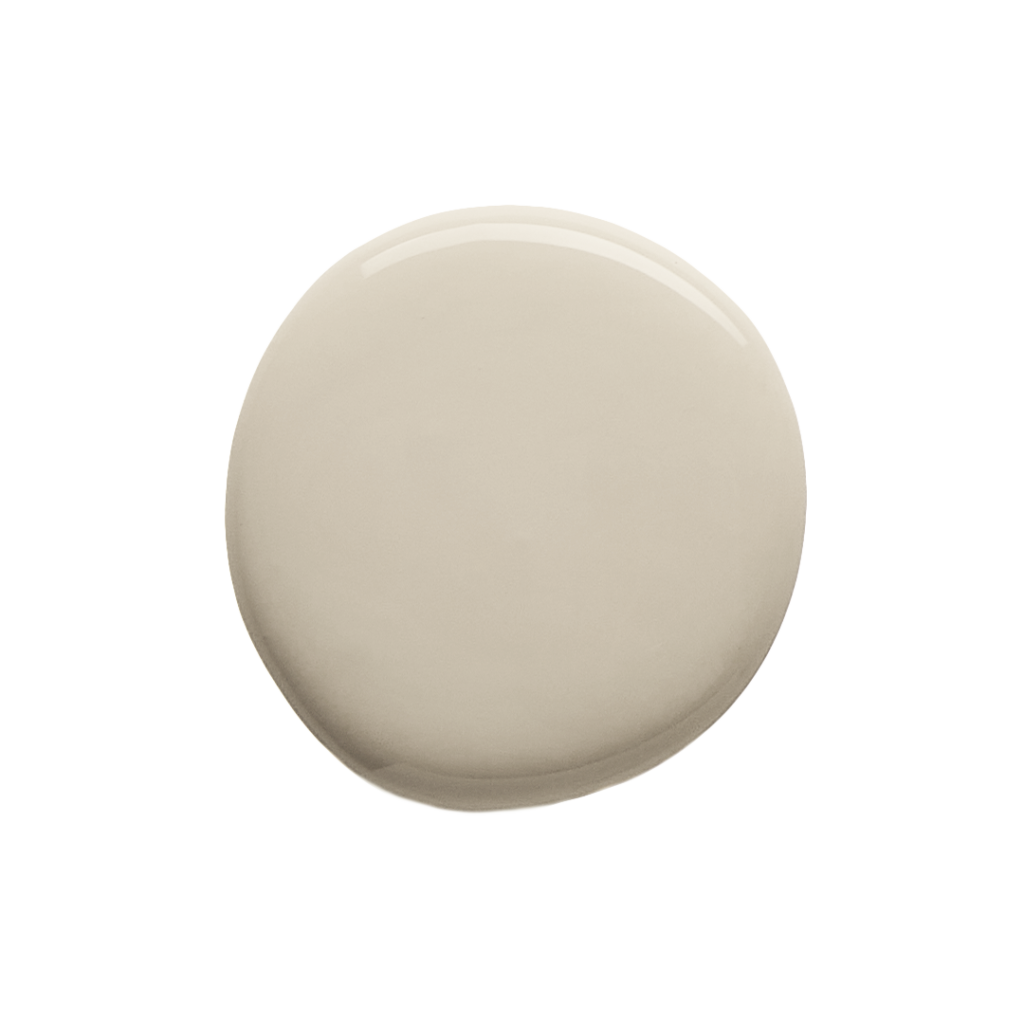
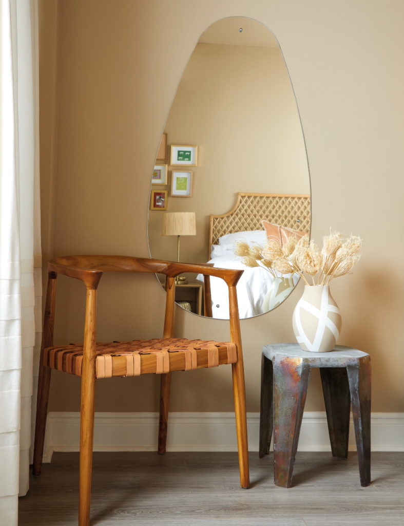
Muted Brown
VIEW COLOURCreate your sanctuary with Sage Green
If it’s invigorating and inviting that you’re hoping to make a space feel, then Sage Green is your sanctuary solution. An ode to velvety sage leaves, this glorious green with its grey undertones is the ideal way to liven up your interior spaces. As working from home becomes more and more common, this has undoubtedly become our go-to green for at-home offices. A refreshing shade like this can make you feel at ease and decrease stress levels in what can sometimes be a frantic space.
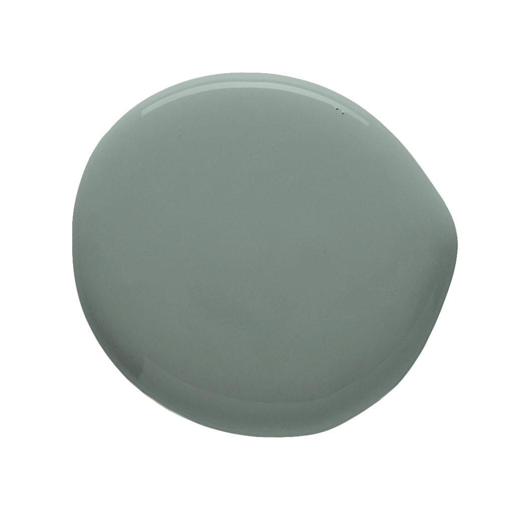
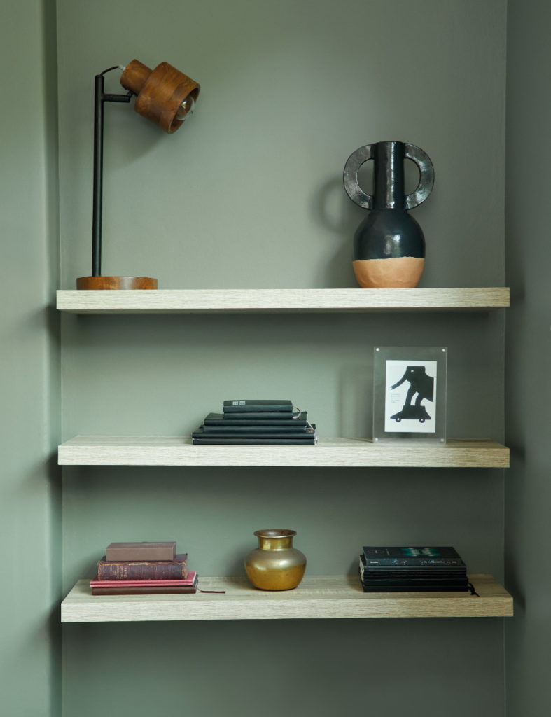
Sage Green
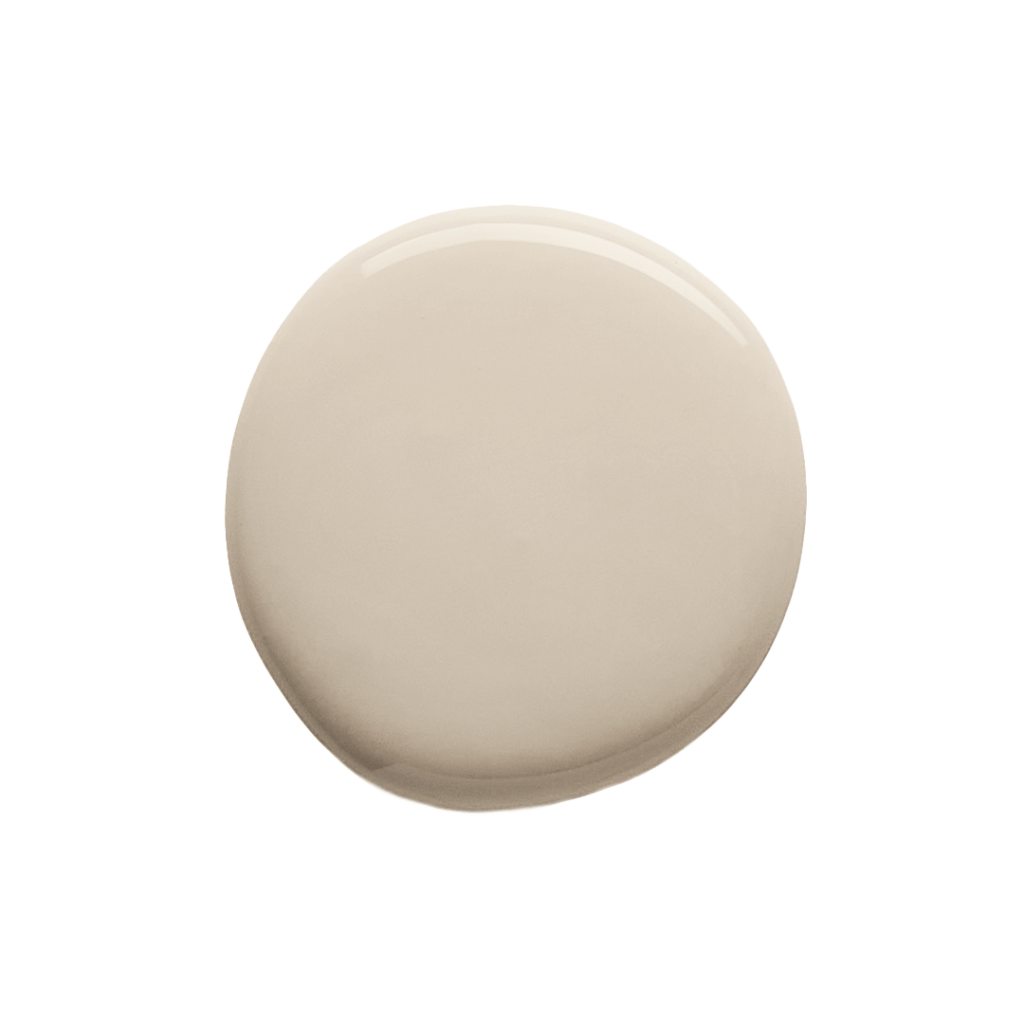
VIEW COLOURRelax in the comfort of Cool Beige
If it’s light and bright (with a whole lot of timeless) that you’re wanting to bring to a room, it simply doesn’t get better than our shade of Cool Beige. This elegant neutral is uplifting and calming all at once, perfect for interior spaces where relaxation is key. The beauty of this versatile shade is that it creates an elegant interior foundation, just waiting to be complemented by texture, décor and similar tones to match.

Cool Beige
VIEW COLOURKeep it classy with Light Pink
If it’s a fresh take on gentle neutrals that you’re hoping to make happen, then Light Pink is your winner. This understated shade brings nothing but soothing calm and a whole lot of sophistication wherever it’s used. While some may think there’s simply no right place for this shade in their home, this stunning powder pink has made its debut in one of our favourite kitchens from 2021. Known for its associations with love and romance, this trendy take on neutrals is bound to make its way into many homes, bringing nothing but pure joy.
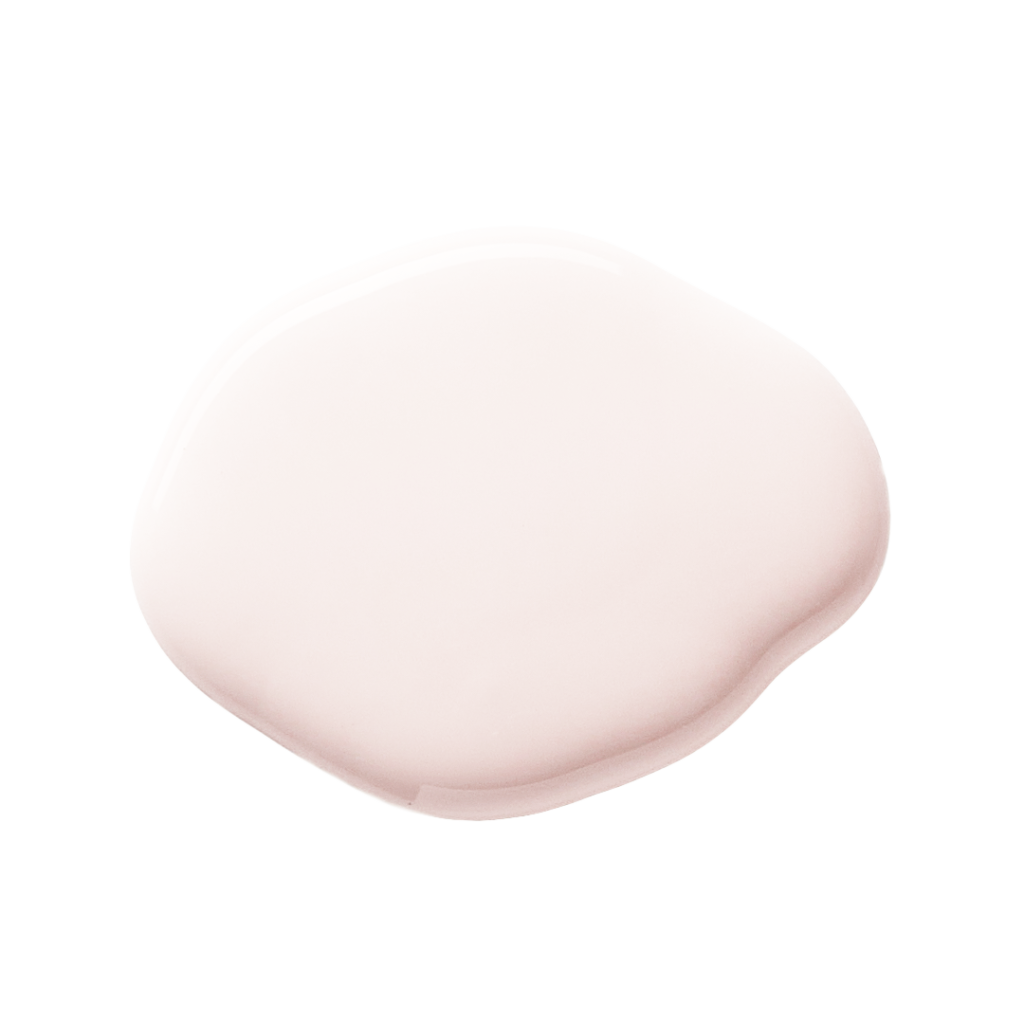
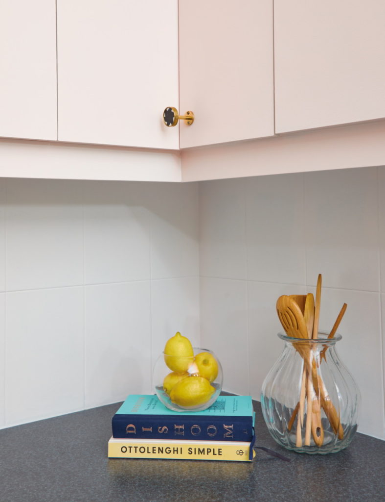
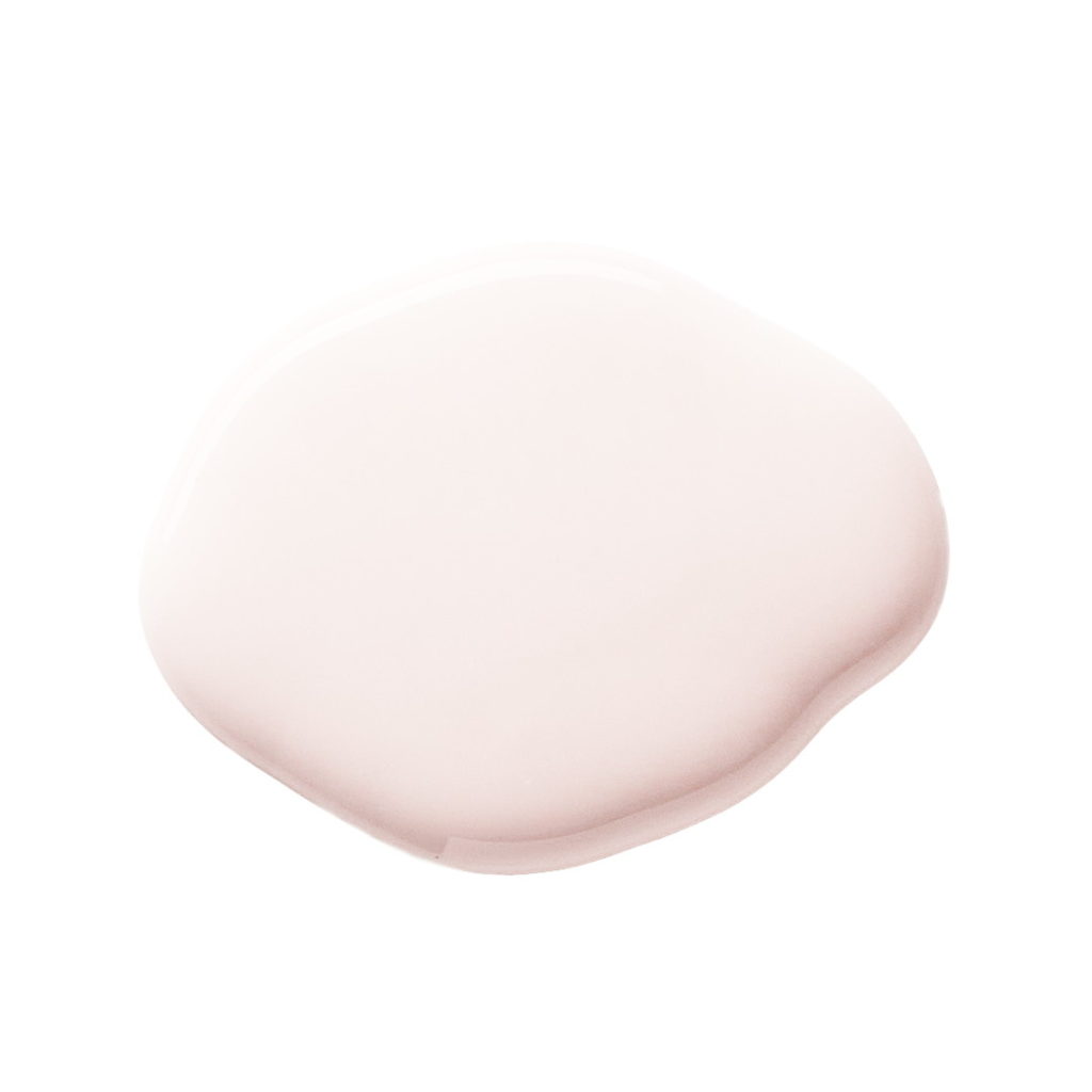
Light Pink
VIEW COLOURBask in the beauty of Warm Yellow
If it’s unlimited sunshine (and a whole lot of softness) that you’re aiming to achieve in a space, then Warm Yellow is the one for you. Smooth and buttery, this understated shade is a celebration of happiness and joy – making it the perfect addition to any space you’re hoping to uplift. It’s associations to happiness, sunshine and all things positive make it the ideal addition to any fresh start in 2021.
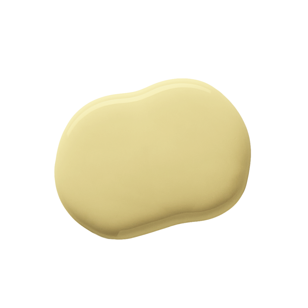

Warm Yellow
VIEW COLOURNo matter which colour you choose, there’s no doubt that there’s more to paint than how it looks on your walls. It’s the perfect opportunity to create a space that makes you feel most like yourself. Visit our curated colour palette to see more shades or visit our colour expert to find your favourite for that next painting project.