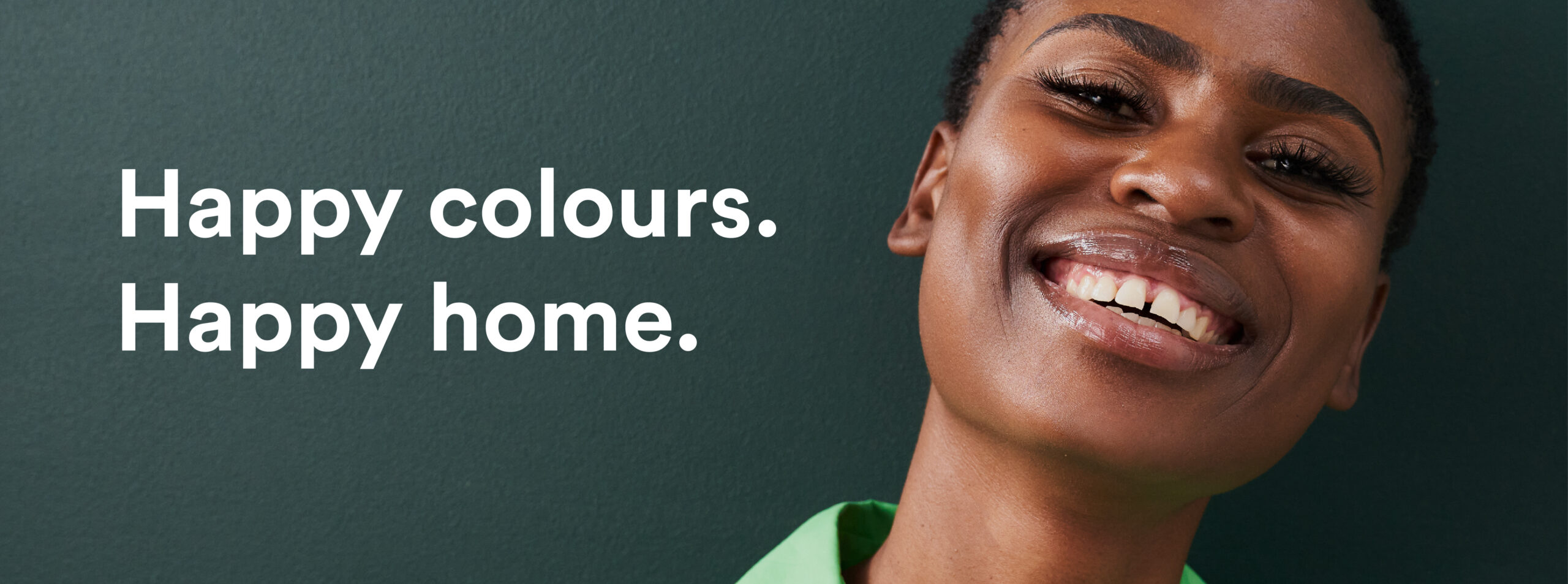
Have you thought about how colours make you feel? We have.

Colour is without a doubt the greatest tool in any designer’s toolkit. Whether it’s graphic design, industrial engineering or graffiti, colour plays a vital role in conveying a message, and ultimately a feeling, to the viewer. So how does it work and why exactly do colours make us feel things?
The reason for this is pretty simple, but also a little bit to wrap your head around. When light enters your eye’s pupil it is broken up into wavelengths of colour. Those wavelengths then hit your retina and are converted to electronic pulses which travel to the brain for translation, via your optic nerve. Still with us?
These pulses travel to a part of the brain called the “hypothalamus” – the part of our brains where emotion comes from. This means that colour quite literally evokes emotional responses from us as humans. And it’s this relationship between colour and emotion that various industries and disciplines have been utilising to their benefit, dare we say for centuries. Think about the upper classes in the Middle Ages and what it meant to be able to afford to wear any colour at all. Colour has always had a message to convey and the psychology attached to it is how we interpret those effects.
We will certainly cover this in more depth in another post, for now, let’s dig into the actual things which different colours make you feel, and why. It is important to note that while how we perceive colours can be subjective to an extent, there are some meanings which are universal.


Depending on how intense the colours are, warm hues can be very energetic, energising or representative of energy. Red makes us feel feelings of love, passion, but also of rage, and anger, makes sense if you think about it. If red is too intense for you and your space, we would suggest choosing a pink. Pink has been scientifically proven to calm people down and is also one of the oldest colours found in nature. Choosing a pink for your space allows you to create a calming space that has the beauty of colour with the added versatility of a neutral. Our top picks for a timeless pink would be Muted Pink, Terracotta Pink or Blush Pink. Orange, like our Rich Orange, for example, is a lot more energising, stimulating and playful, and yellow is also happy, friendly and optimistic (our Blush Yellow is a perfect example of a colour that has a subtle touch of colour without being overwhelming). So it’s likely a better idea to paint a feature wall in your reading room yellow, or orange, as opposed to a bright red. If you are a risk-taker and red is the colour for you, our Terracotta Red is an ideal shade of red that has the energising qualities of a red without the intensity and feelings of danger often associated with a bright red.


Next up, cooler colours. Right before the hues switch to predominantly blue, you’ll find the greens. Greens remind us of our connection to nature, the importance of stability, creativity and freshness – sounds kind of perfect for a feature wall in a bedroom, right? Once we cross into the blue hues, things become more relaxing, inviting and tranquil. Blues make us feel trust, peace and serenity. Purples, like our Dark Purple, make us think of style, sophistication and luxury. Our Muted Lavender is a more calming and refreshing take on purple and is designed to create a stress-free, relaxing and peaceful space for anyone who uses it. Purple consists of blue and red, so it possesses both energising and calming qualities, perhaps that sweet spot in the middle is where its allure stems from.
As you can tell, colour can affect our emotions in a wide range of ways so when you undertake your next DIY project be sure to consider how the colours you choose will make you feel. Light will also play a massive role in how the colours you choose look in the spaces you have available to you. Ultimately, choosing the perfect colour really could help perfect the way any room looks, and makes you feel. If you still need some help choosing your perfect colour, we have you covered with our Colour Expert..
