Understanding Colour: The Basics of Colour Science
Why Colour Matters in Everyday Life & Interior Design
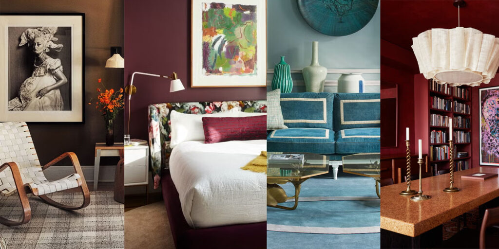
Colour is a powerful force that shapes our everyday experiences. Ever noticed how fast-food chains use reds and yellows to spark hunger, or how hospitals favour soft blues and greens to create a sense of calm? Colour is a crucial part of any interior space. Whether you’re an interior designer, decorator, handyman, or architect, understanding colour theory helps you make better design choices, improve the atmosphere of a room, and even influence how big or small a space feels.
Choosing paint colours is not just about picking a shade you like—colours interact with each other, reflect different types of light, and can completely change the overall look and vibe of a space. With so many options available, having a structured approach to colour selection is essential to avoid any clashes and disappointments. Whether you’re working on a residential renovation, a commercial project, or a simple room refresh, knowing how to use colour theory can be the difference between good or flipping amazing.
The Colour Wheel: The Basics of Colour Theory
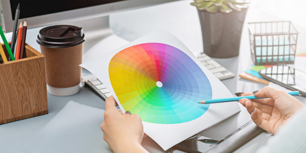
When you’re still in the planning stages, before even picking up a paintbrush, let’s talk about the colour wheel—a faithful guide for understanding colour psychology and creating coordinated and stylish colour schemes for homes.
Primary, Secondary, and Tertiary Colours
- Primary Colours: Red, blue, and yellow—the building blocks of all other colours.
- Secondary Colours: Orange, green, and purple—formed by mixing two primary colours.
- Tertiary Colours: Think of these as in-between shades like teal or vermillion, created by blending primary and secondary colours.
Warm vs. Cool Colours
- Warm Colours (Red, Orange, Yellow): Energising, inviting, and perfect for social spaces.
- Cool Colours (Blue, Green, Purple): Calming, peaceful, and ideal for chilled spaces like bedrooms.
Pro Tip: Want a small room to feel larger and more open? Go for cool tones! Looking for warmth and cosiness? Opt for warm shades.
Colour Harmony: Creating Balance and Beauty
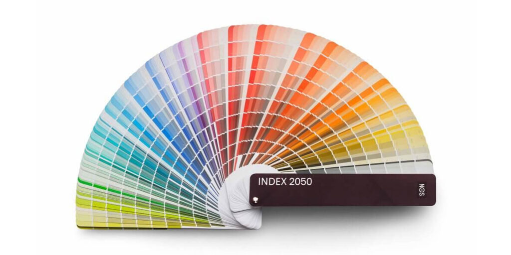
How the NCS System Makes Choosing Paint Colours Way Easier
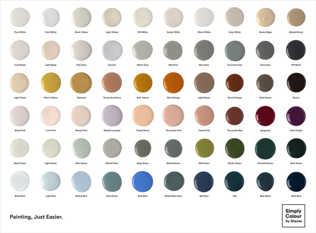
Ever stood in front of a wall of paint swatches, totally overwhelmed and wondering why there are 50 shades of white? We get it. Choosing the right paint colours can feel like a never-ending guessing game. But here’s the good news: the Natural Colour System (NCS) is basically your secret weapon for picking the perfect shade without second-guessing yourself. This is the system Simply Colour uses to create its range of amazing paint colours.
Unlike random colour charts or trial-and-error methods, the NCS system is a universal colour-matching tool that works the way our eyes naturally see colour. Used by architects, interior designers, and decorators worldwide, it helps you find the right colours effortlessly—whether you’re painting your bedroom, revamping an office space, or giving your entire home a glow-up.
Why the NCS System is a Game-Changer
- No More Colour Regret – Ever picked a paint colour, only to hate it once it’s on the wall? The NCS system helps you choose scientifically balanced shades, so your walls always look as good as they do in your head.
- Match Like a Pro – Got a couch, a cushion, or even a tile you love? The NCS system lets you find a paint colour that matches it perfectly—so no weird clashing tones ruining your zen.
- Harmonised Colour Combos – Agonising over which colours work together? The NCS system suggests coordinating colours for a seamless, aesthetically pleasing look across your space.
- A Global Colour Language – The NCS system is used everywhere—from high-end architecture to street art. So whether you’re DIY-ing or working with a designer, it ensures everyone’s on the same page when it comes to colour.
How the NCS System Helps You Nail Your Colour Choice
Think of it like a cheat code for colour selection. Instead of blindly picking a shade and hoping for the best, the NCS system lets you:
- Create smooth transitions between rooms, so your home flows beautifully.
- Avoid random colour disasters by suggesting well-balanced palettes.
- Make quick, confident decisions instead of going back and forth doubting your choices.
At the end of the day, the NCS system is all about making choosing paint colours easy, stress-free, and foolproof. Whether you’re repainting your whole house or just adding a splash of colour to one wall, this system has your back. So go forth, pick that perfect shade, and never regret a colour choice again.
Understanding How Colours Influence Mood
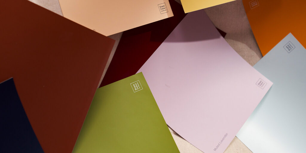
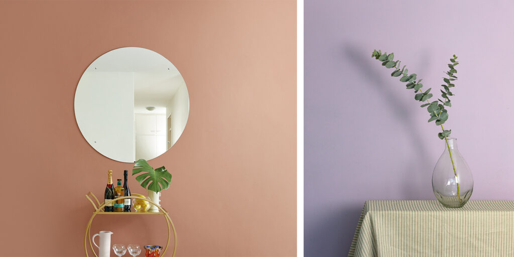
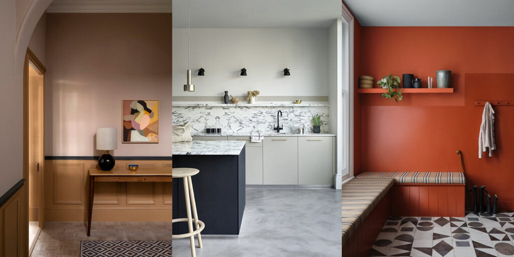
Colour isn’t just about aesthetics, it shapes how we vibe and move through a space. Interior design trends in 2025 are focusing on natural, earthy tones that create a sense of peace and harmony, perhaps an antidote to our fast-paced, tech and social media-driven lives. Soft sage greens, warm terracotta, like this one from Simply Colour, or muted lavender are rising in popularity as they blend seamlessly into modern aesthetics while offering psychological benefits like cosiness, comfort, and calmness.
Choosing Paint Colours: A Step-by-Step Guide
With so many options, choosing the right paint colour can feel like a total mission. But don’t stress—these steps will make the process a breeze:
- Assess Natural Light in Your Space: Lighting changes how colours look—test swatches on different walls and observe how they appear in morning (with your coffee), afternoon (while hydrating on H2O), and evening light (while sipping on a sundowner).
- Consider Room Function and Atmosphere: Match your colours to the purpose of the room:
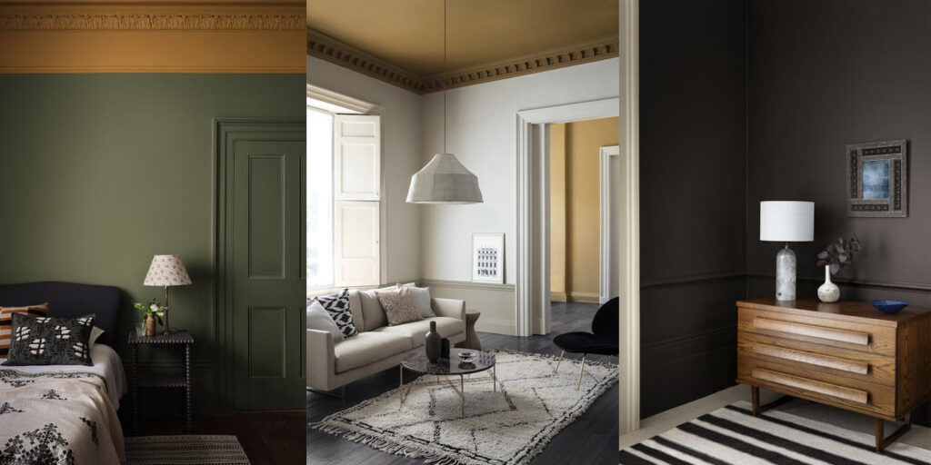
- Relaxing spaces call for cool tones like blue or green.
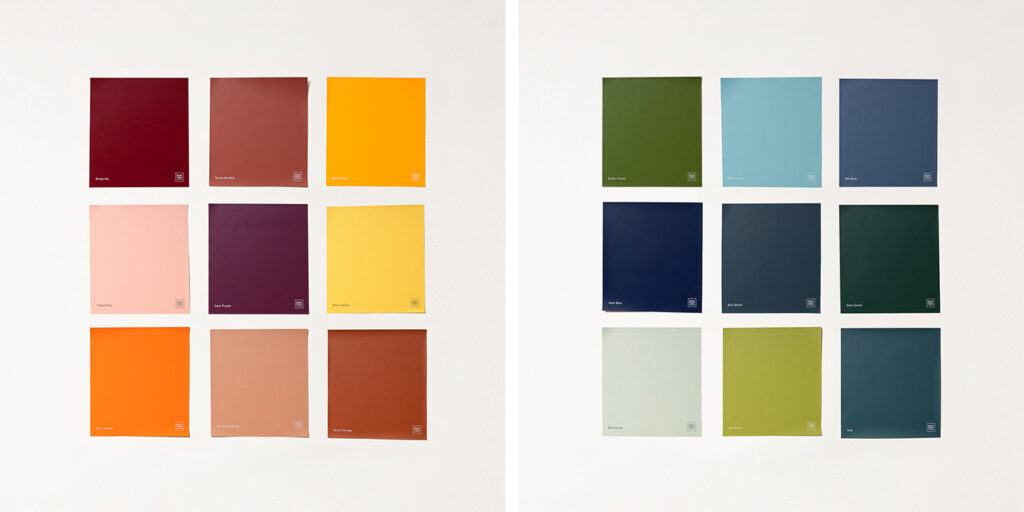
- Social areas are best experienced with warm tones like Simply Colour’s terracotta red, warm yellow, or rich orange.
- Work with Existing Décor: Your wall colour should complement and elevate furniture, flooring, and textiles, not clash with them!
- Test Colours Before You Commit: Sample pots or test swatches, like Simply Colour’s Peel + Stick Swatches, are your best friend! Visualise what the colour will look like with a small trial section before going all in.
Common Colour Mistakes and How to Avoid Them
It’s easy to mess up when choosing paint colours to fit with your interior home décor. Avoid these common mistakes:
- Choosing Colours in Isolation – Always consider how your chosen shade will look in natural light and against your furnishings. Take a swatch and hold it against a couch or curtain.
- Ignoring Undertones – Some neutrals have hidden pink, blue, or yellow undertones that may not match your décor. Always test samples in different lighting conditions to ensure the colour blends naturally with your unique space.
- Overusing Bold Colours – Accent walls add drama, but go overboard and your space might start screaming instead of speaking. Keep it bold, but balanced!
Bringing It All Together: Your Perfect Colour Palette
By understanding the basics of colour science, utilising the NCS system, following expert tips and this year’s hottest paint colour trends, you can confidently choose paint colours that reflect your style and personality, while enhancing your space. Whether you’re drawn to oh-so-chilled blues, get-up-and-go reds, or down-to-earth greens, the secret is in finding the perfect pairings and flow.
FAQ: Your Colour Queries, Solved
Still unsure? Here are some common colour-related questions, answered:
What’s the best colour for a home office?
Green and blue promote focus and reduce eye strain—perfect for productivity and lowering stress levels during busy, multi-tasking times.
How do I make an open-plan space feel cohesive but not boring?
Stick to a consistent base colour and vary shades or accents from room to room. For example, if you choose soft greige as your foundation, you can add depth with navy, forest green, or warm mustard accents in different zones to create subtle separation.
What’s the safest colour choice if I plan to sell my home?
Stick to warm neutrals like greige, soft white, or taupe. They appeal to most buyers, make spaces look brighter, and give potential homeowners a blank canvas to work with.
Can I mix warm and cool tones in one space?
Absolutely! The trick is balance. If you have a cool-toned wall colour (like grey or blue), add warm elements through wood finishes, textiles, or accent décor to keep the space from feeling too cold.
The bottom line is: have fun, experiment with colours you’ve never tried before, trust your instincts, and create a home that feels uniquely yours. For a paint colour range that will get you excited, go to Simply Colour!
